
Solutions
Kolar delivers comprehensive design services, from concept to completion.
explore by industry


design services
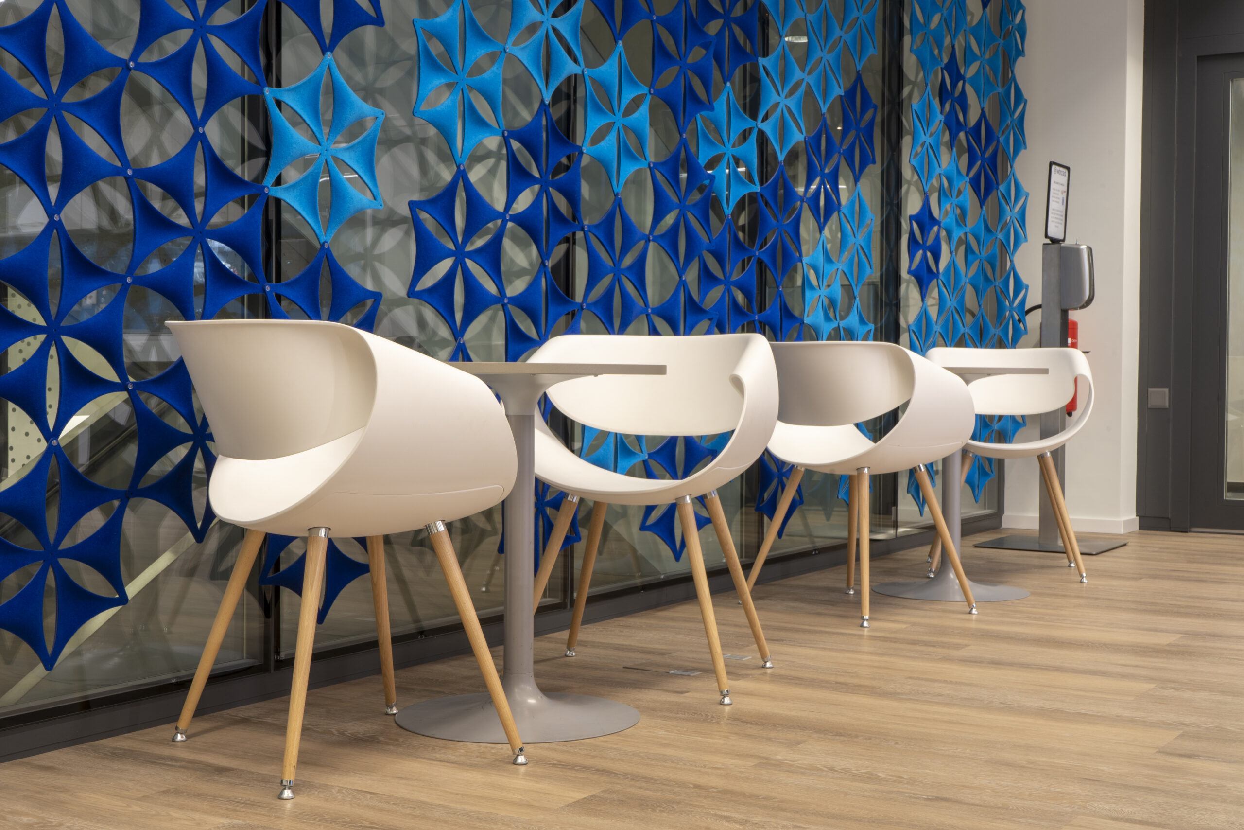
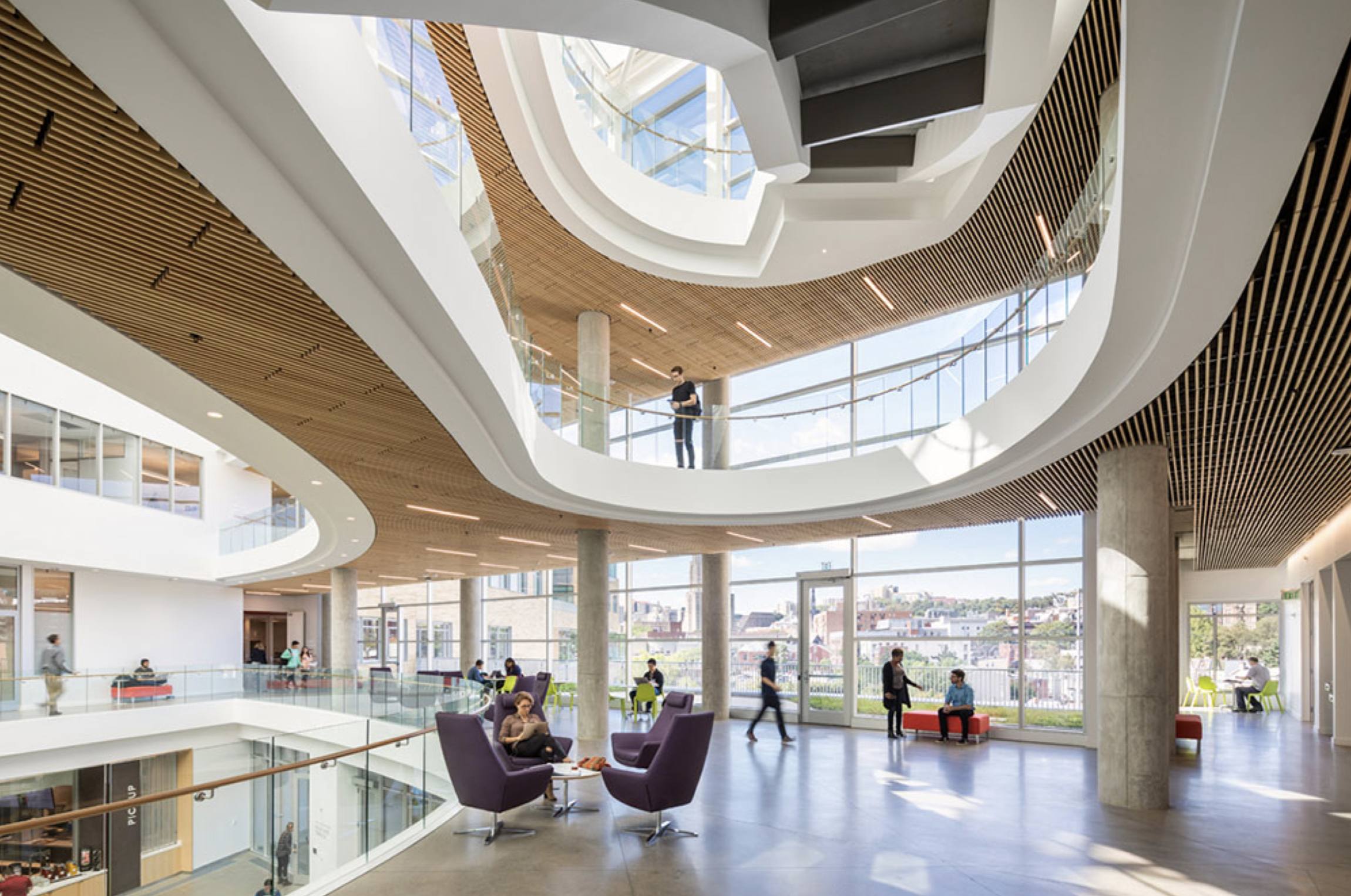
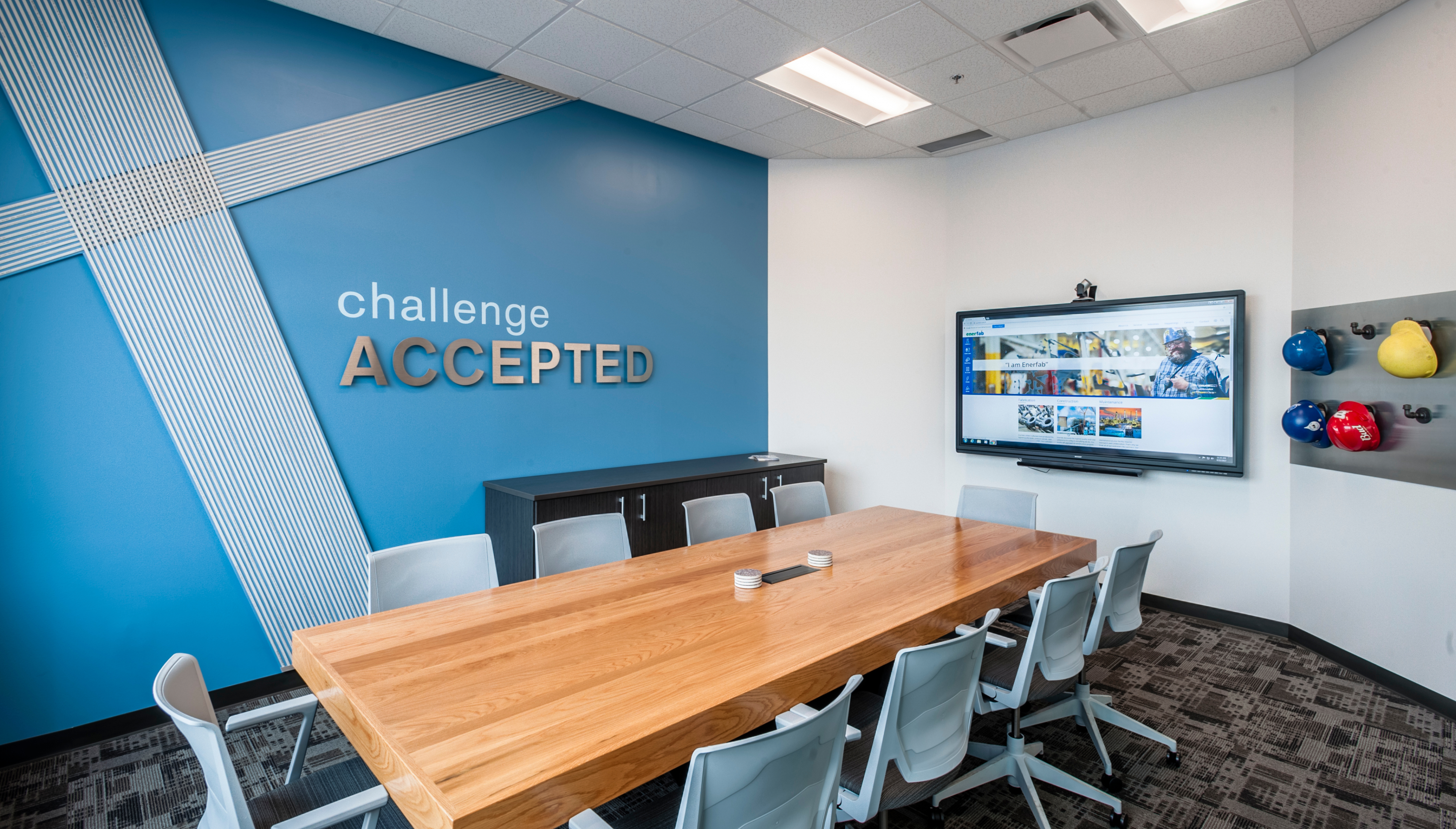
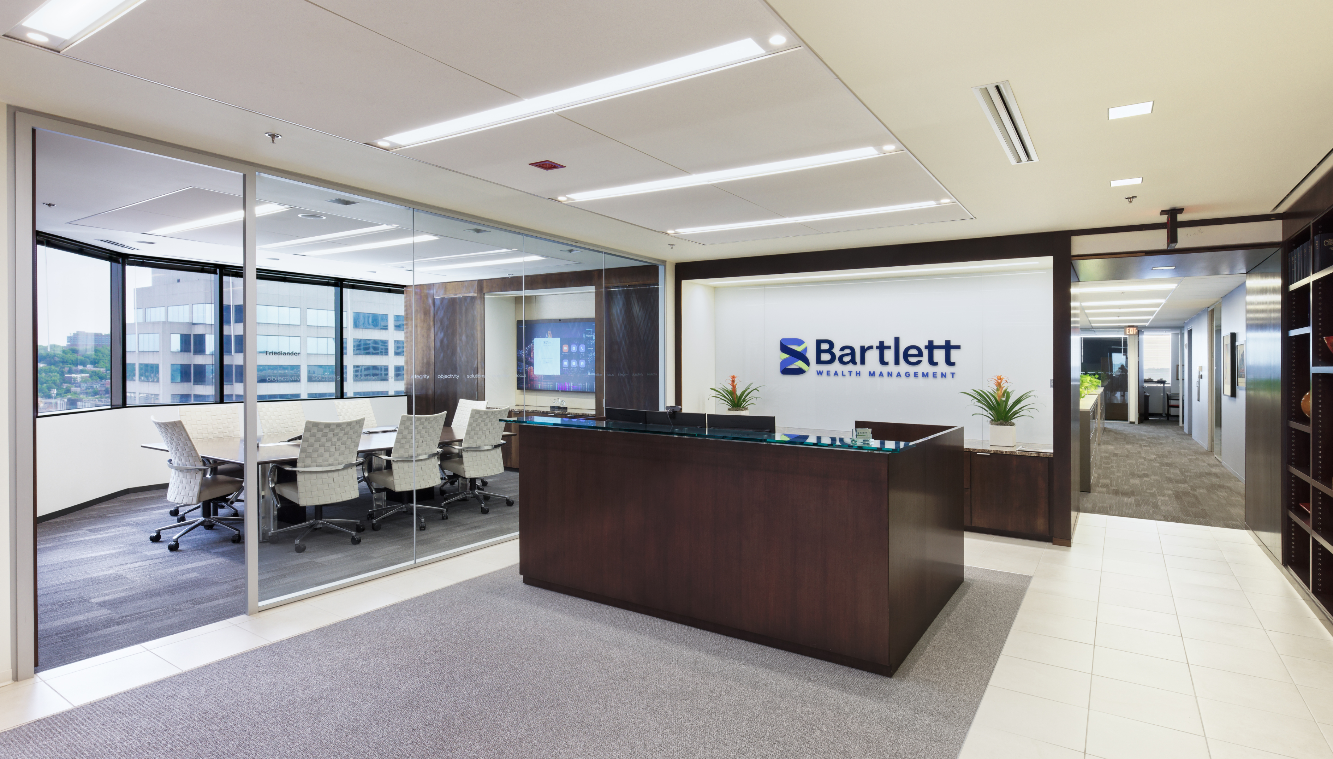
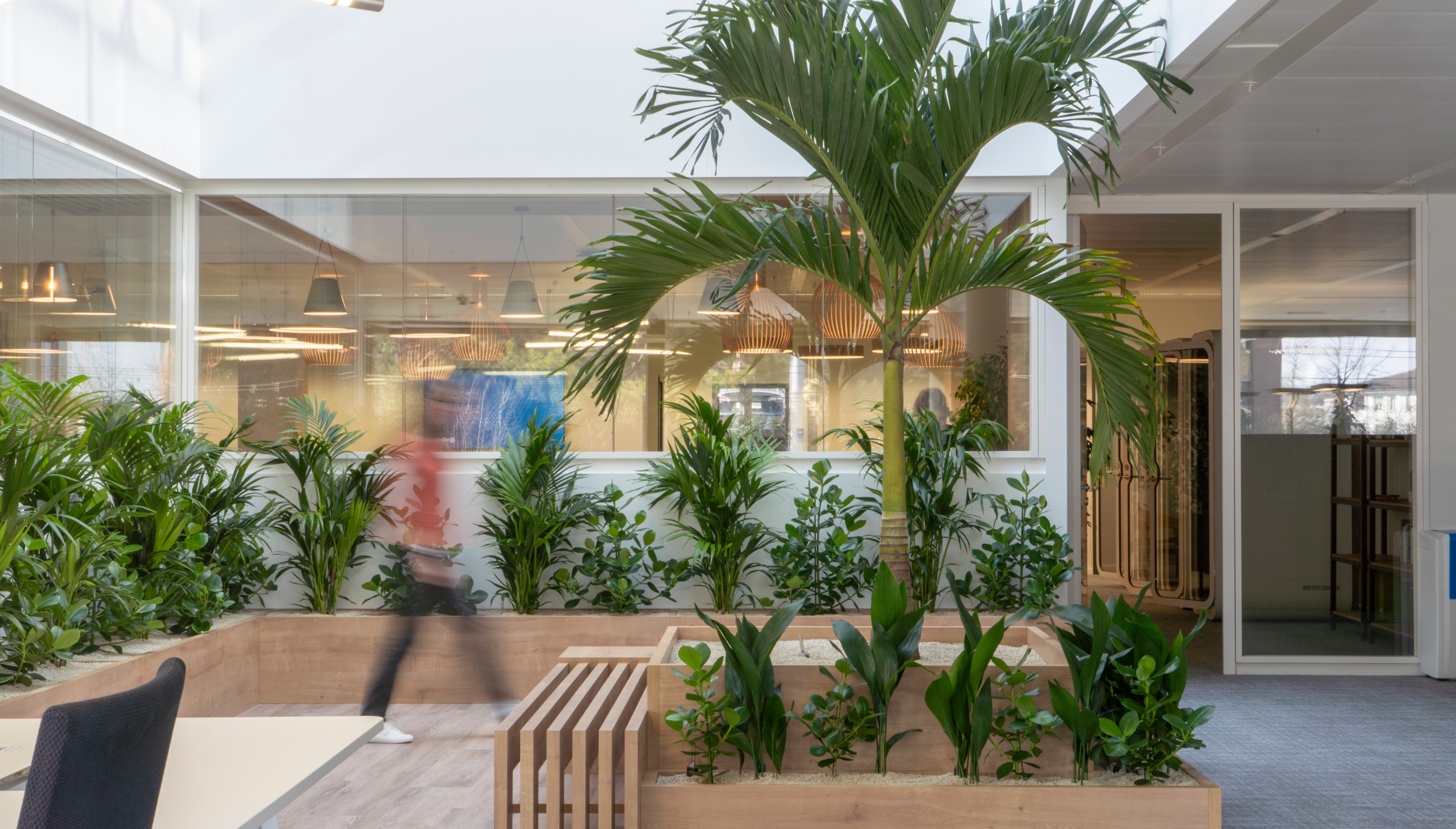
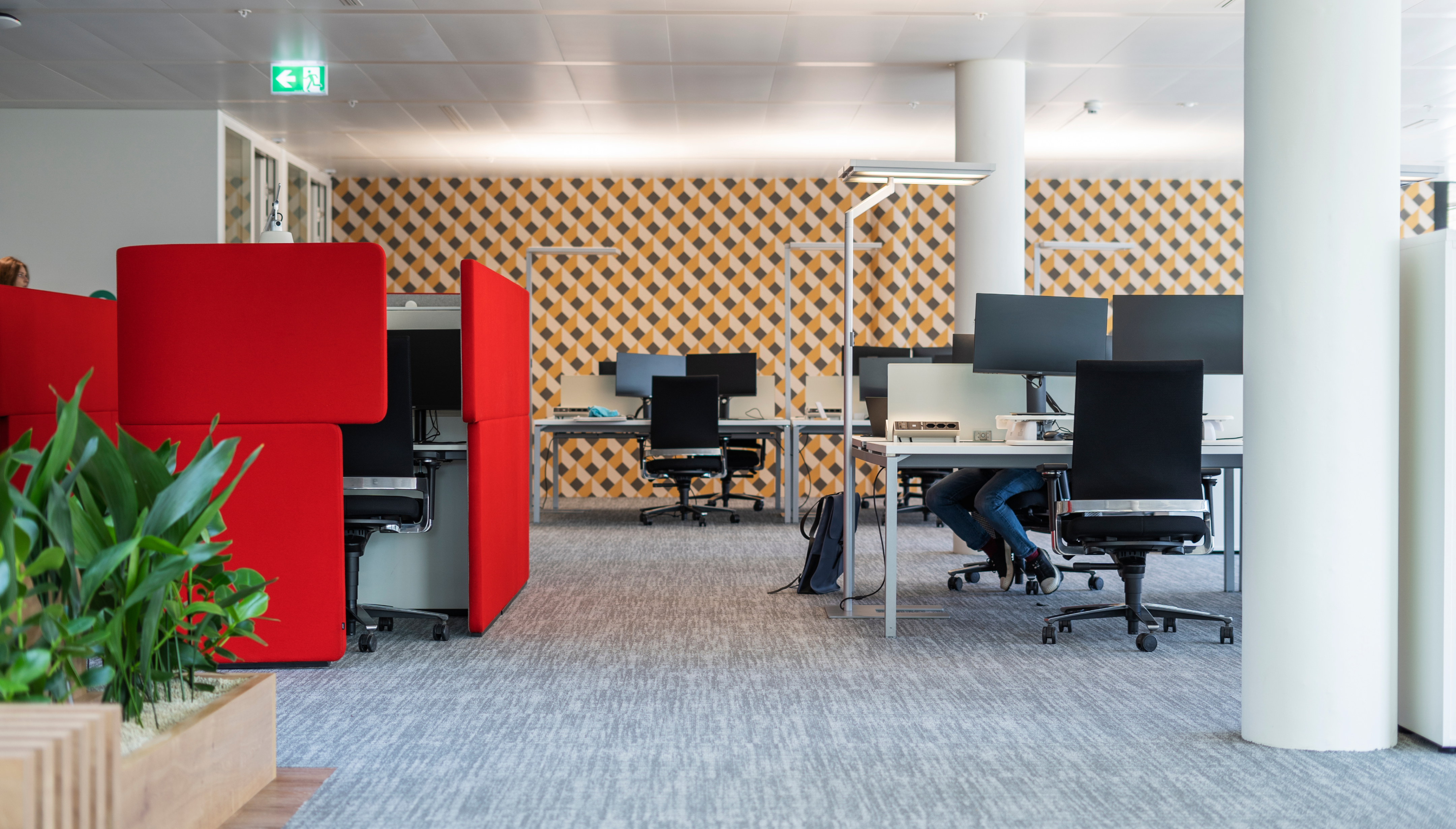
interior architecture + design
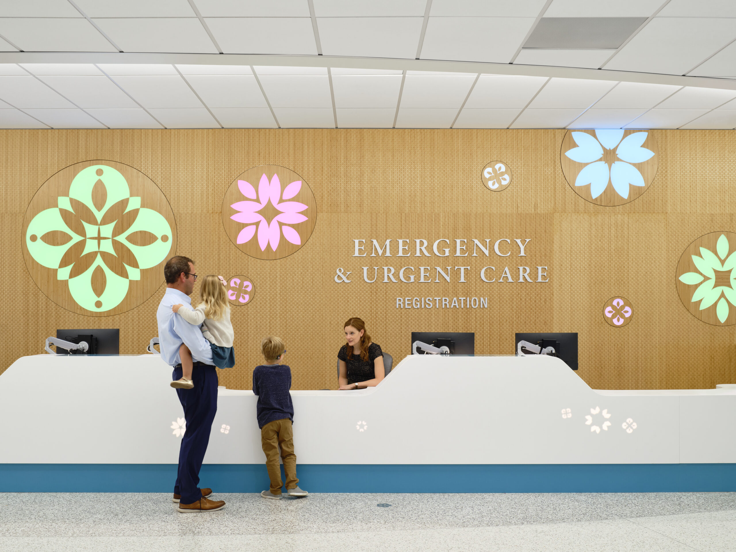
branded environments
research + insights capabilities
research
visioning
strategy

Kolar delivers comprehensive design services, from concept to completion.
Programming and Scope Definition: Define project scope and requirements to meet your needs.
Space Planning: Strategically organize your space to optimize flow, functionality, and aesthetics.
Design: Crafts bespoke environments that reflect the best of your brand.
Furniture, Furnishings, and Equipment (FF&E): Select and coordinate furniture, fixtures, and equipment that complement the architectural space and enhance functionality.
Branding: Integrate your brand into the physical space to create a consistent and immersive experience.
Signage + Wayfinding: We design intuitive signage and wayfinding systems that guide visitors effortlessly through your space.
Artwork Programs: Curate and implement artwork programs that add aesthetic value and inspire those within the space.
Guidelines + Toolkits: Provide comprehensive guidelines and toolkits to maintain brand integrity across all physical touchpoints.
Trends Research: Stay ahead by analyzing emerging trends across industries to integrate forward-thinking elements into your space.
Competitor Benchmarking: Evaluate your competitors’ spaces to ensure your environment stands out.
User Experience Research: Gathering insights from end-users to create spaces that are both functional and inspiring.
Future Vision Casting: Get ideas for future spaces that not only meet current needs but also adapt to future changes.
Strategic Roadmapping: Develop actionable roadmaps that guide the evolution of your space to meet long-term business goals.
Engagement Workshops: Engage stakeholders to co-create solutions, ensuring alignment and fostering ownership of the final design.
Culture & Change Management: Integrate company culture and manage transitional changes to enhance employee acceptance.
Space Analysis + Preliminary Programming: Conduct thorough space analysis and preliminary programming to optimize spend.
Planning and Optimization: Maximizing space utilization and operational efficiency for both immediate and long-term needs.